Words Made of Design
What you speak though words could be easily yet beautifully be spoken through amazing artistic designs, and magazines' covers should be no exception. Here’s one young Greek-Palestinian artist; Arsen (<left), tells it all through his worked on covers. He talked about each of the covers he designed for My.Kali.mag since March 08, what his points in each one, the picture he wants you to see through each one of them. This talent knows no-quitting over good work, instead he keeps on the improvements, dashing good one after another, giving each cover the exact theme the magazine is going for and giving My.Kali the privilege of working with him. Here’s his comments on each of the covers he ever designed for My.Kali.mag…
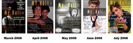
March 2008: I did a dark cover with the first cover design of mine with big colourful fonts for the titles, to protect Khalid after the media storm against him, and to make sure that the viewer will be attracted to read all the titles without focusing on one and leaving the other. Main theme was "Like a Virgin?"
April 2008 (Tween Edition): On April issue, we had two guys, a teen and a tween from Amman on the cover, the original cover was different from the one was published again for security reasons, so I had to make the cover again darker with big fonts, since we had a lot of eyes watching it, nothing special with the design, to underline.
May 2008 (The Lesbian Edition):The Lesbian Edition! Yeap this time we decided to choose Marge Simpson to model for us, since it wasn’t that safe for local models to be on the cover. The general look is black and white, having spots of lights and shadows on the surrounding of the titles written in Golden colour, showing that My Kali Magazine has started to reveal the Lesbian issues, and giving them more space inside this small warm home of ours.
June 2008: Having Eduardo on the cover from Milan, giving a fresh look for our magazine, and a fresh face, and since this Edition was all about power, so I decided to give it a sharp look, with focusing on specific words written there, with some font styles, and using Black mostly and white on top to keep the colours simple on the cover. Main theme was "The Cartier Boys".
July 2008 (La Isla Bonita Issue): They might call it La Isla Bonita Issue, but I’ll call it the Happy issue! It was the happy issue even while I was designing it, the colours, Happiness, candies and romance they all jumped on the cover out of nowhere! Remembering that innocent child inside each one of us, always seeking joy no matter what.
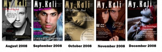
August 2008 (The Material Boy Issue): This Issue was the issue when our Designs started to improve, having good photographic background, and well designed Titles, on this issue; we had Ferenc on the cover from Hungary, black and white Photo, with semi-formal font styles because of the serious issues we were talking about in this Edition.
September 2008 (The 80's Issue): In this issue, I had to go back in time around 30 years in less than a week time! The 80’s Issue was one of the best experiences I had while designing since I was in the photographic session, now the design was based on the 80’s, having Khalid on the cover with his 80’s look, and so I tried using Fonts, colours, and designing methods from that time, and to put it on a magazine cover that carries the date “September 2008” That was my biggest challenge.
October 2008 (The Solitaire Issue): A very simple successful Photograph, tired to keep the cover as simple as I could, using white colour for the titles and some black, and using small sizes, to try to keep the photo revealed. Down on the corner I did a small simple design on an article for single people, just to add some movement into the cover.
November 2008 (The Trans? Issue): One of the ones I like really… I enjoyed the dark brown photo with the look of the two faces, attracting the viewer into the middle of the cover, which is pretty helpful. For the design, I used white colour, and light brown, playing with the sizes to pump up some of the words in the viewer’s eye.
December 2008 (The Sexual Issue): Very inspiring Photo, with a lot of meanings, tired to bring the photo’s atmosphere into the design which was made only with white simple font and red brush stroke, which went in harmony with the photo to create this nice cover.
